What I'm referring to in the title of this post is probably what happens to all of us at one time or another. You think a piece is finished and then you look at it again with new eyes and it's just not right for one or several reasons. If you're anything like me, you'll spend a large amount of time analyzing what went wrong. This business card case is a good example of that.

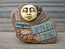
I took this out of the oven late Friday night. Maybe I was just overly tired or I had a momentary brain lapse but, I went to bed thinking it was finished. When I looked at it the next day, I wasn't happy with it at all. I went ahead and took a photo and continued to worry about where I went wrong with this piece. I disliked so many things about it. There were too many circles and they just seemed to be floating. The vertical line formed by the cane pieces was strong but the two pieces in the center near the wiggly stripes were not doing anything to create visual interest horizontally. They didn't even look like they belonged. The big lime green circles had no connection colorwise to the rest of the piece. And, there seemed to be too much "Skinner blending" going on and nothing that was standing out graphically other than the wiggly stripes. Luckily, with this type of piece, it's not impossible to fix some of your mistakes.

I don't think it's perfect but, it's much more pleasing to my eye now with just a couple of additions. The black and white circles helped fill in the gap and added a more bold and graphic element to the piece that was lacking. They also helped to pull those two cane slices that seemed to be floating off to the sides before, into the design, and framed the center cane slice to create more of a focal point. The addition of the flattened lime green pieces did several things. They helped complete the horizontal line, they related colorwise to the lime green circles I had already used, and they helped break up all the circles I had going on.
I don't consider myself a design expert by any stretch of the imagination but, by immersing myself in my mistakes on a regular basis, I've learned a lot. Whenever possible, I highly recommend taking advantage of the valuable learning opportunity that correcting your mistakes provides. This concept is applicable to NFL football players, as well.


12 comments:
Kudos Kimmy....Your 1st pic was nice, but I have to admit, your adjustment made the difference!!!
You're lucky that you could add elements to improve your original design. Generally when I'm unhappy with something, it's because I've got too much going on and I can't remove rivets or drilled holes etc. I just have to chalk it up to a learning experience.
Thanks, Tam!
You're so right, Libby. Some learning experiences are more painful than others, aren't they? I used to get upset when I couldn't fix things but I think I've learned to put it in perspective and take away the knowledge of how to make it better next time. It's way more productive than crying about it!
It went from pretty to amazing but what's even more amazing is your analysis!!!!! Obviously an artist's mind!!
Well that is one Half Time Show I wouldn't want to miss!!...I love the added elements to your case...:)oh...and way to go Giants!!
Great i. e. Kimmy!
Susan, I think we probably judge ourselves and our work more harshly than anyone else does but to me, that seems normal and healthy and the best way to improve. I can analyze the sh$# out of things - just ask my husband!
Thanks, Melanie!
Hmmm . . . rescue me, someone!Does "i.e." stand for independent evaluation? I don't think I've ever heard that before since I live such a sheltered life but, after thinking about what it "might" mean (that was fun!), my brain happened upon independent evaluation which I love, btw. Am I right?
What a great post! To see the piece as you did, to be allowed into your thinking of why you didn't quite like it, and why the additions you made improved it. It was like having that wish answered "I wish I could have been a fly on the wall" so I could hear/see that process!
And I too have no idea what i.e. means.. but like you, it was fun trying to deduce it. "Interventional Elevation"? LOL!
I like the 'floating' effect of the circles, kinda psychedelic. Nothing wrong with that and the colours work well. The added pieces made the difference by drawing more interest to the center and overall look. Kinda 3-D!
Post a Comment