 Ford & Forlano have some things showing up on Seattle's Facere Gallery site and on their website that color wise, are much brighter and bolder then what I've seen from them in the past few years. This "Square Wheel Brooch" is lovely and I'm glad I finally realized that it's not a bracelet as I originally thought. I couldn't figure out how anyone was going to wear it comfortably as a bracelet because it's NOT a bracelet, it's a brooch! I believe I may have brain damage from the massive amounts of sugar in all the peanut butter fudge I've enjoyed during the past few days. Hopefully, it's not permanent.
This "Blue Char Pin" is quite a departure from most of their work, at least when it comes to color and pattern. I love the distressed colors and the flowing lines that lead your eye through the piece. Truly, a beautiful and elegant piece of jewelry!
This "Multi Bubble Necklace" is another piece that appears to be fairly new. Great colors that are still somewhat muted and subdued but are also all over the color wheel. It's hard to work successfully with this many colors. I'd love to see this piece in person. I'm betting it's quite stunning .

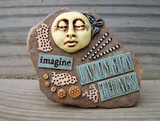
I adore muted and earth tone colors but, I also feel the same way about bright colors. I find myself working with a group of colors for quite a while and then getting a little tired of them and wanting to move on. Of course, color choices can depend on what we're making, the season, and the mood or feeling we're trying to evoke but sometimes, I pick my colors first and then decide what to make. I'm not much of a color trend watcher, although maybe I should be! What about you? How do you pick your colors? Do you follow the trends or let the piece speak to you? And what do you think about these brighter colors from Ford & Forlano? Are the colors working well with the organic forms these artists usually favor? I'd love to hear your thoughts.


6 comments:
KIm, I was surprised to see Pink. never thought they will have eyes for pink. I like bright color myself and usually check out our French clayers for inpsiartion. They have the different way to use colors.
By the way, Nightmare before Christamas is my favorite movie too. Got to love Tim Burton. :)
I like the Blue Char Pin--very, very nice. I am not fond of the bright pink, but maybe that may be I am used to their more muted colors that work well with their forms. I like bright colors as well as muted ones so I think it is more to do with my expectation of their work. The Multi Bubble Necklace is interesting and I like the colors.
I don't follow a lot of the color trends but I am not making a lot of items that it matters, but I do like to watch the trends. Always amazed at how much color plays a role in vintage collectibles and how the color can identify the decade or even the year made.
Hi Ponsawan,
The French ladies definitely have a way with color and design, don't they? Hope you had a wonderful holiday!
Jeanne,
I feel much the same way as you do. I remember when I first saw the more organic-looking pieces that Ford & Forlano were doing, I was a bit disappointed. I missed their bright colors! But now, I love the organic things and it was a bit shocking to see them done with such unexpected colors. I definitely feel that our preconceptions and expectations influence our reaction to certain artists' work. It's great that they keep reinventing their work and aiming for a fresh look, though. I guess I need to try and keep up!
One other thing I have noticed. I am drawn to others work that is a muted palette---much like Ford & Forlano's work and your stones. I have finally figured out why. It is because I have a hard time working in these colors. I have no problem doing the organic thing in paints, but still I am more into sculpting likenesses in clay and using bright colors. When I manage to work in earthtones or muted colors, I do love it---but it is harder for me.
I find the colors that appeal to me have everything to do with mood. I was clinically depressed for years and my color palette for everything was beige, black and earth tones. Once I got treatment, all hell broke loose! My studio is ocher, Mediterranean blue, and marine green. My house's exterior is purple and turquoise (and yes, the neighbors actually love it!). In the shorter, dark winter days, my palette mutes, and then when spring comes around, it blooms like the flowers.
Post a Comment